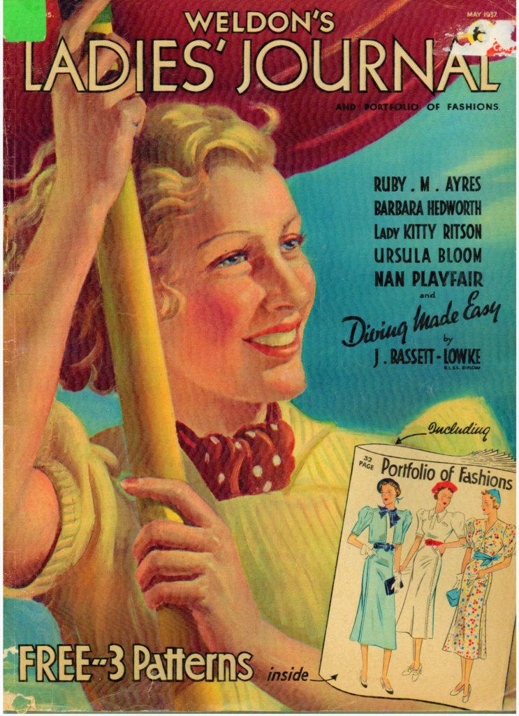
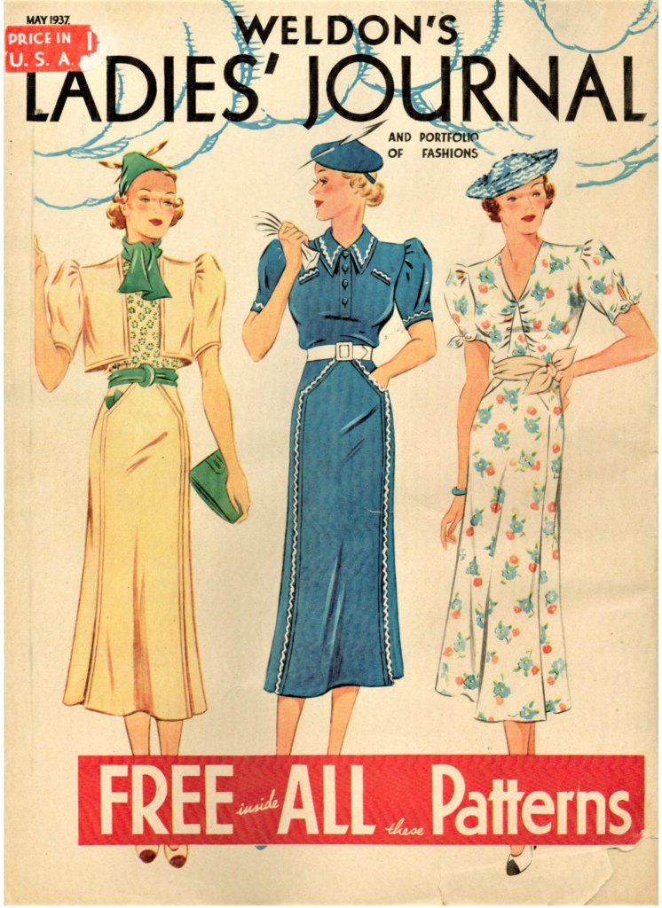
Weldon’s Ladies’ Journal, May 1937 ~ FinnfemmeWeldon’s Ladies’ Journal, May 1937, Frock Sewing Patterns ~ Finnfemme
Weldon’s Ladies’ Journal was a British women’s magazine that catered to the fashionable housewife, with its patterns for pretty frocks. This is the front and back covers of the magazine, with beautiful artwork. I am assuming that most home seamstresses were very skilled, as the “patterns” just show the layout of the pieces on the fabric, with sewing instructions. I didn’t see an actual pattern. Anyway, the dresses are so smart and chic in that gorgeous Art Deco way. The everyday housewife must have looked very elegant in these lovely frocks!
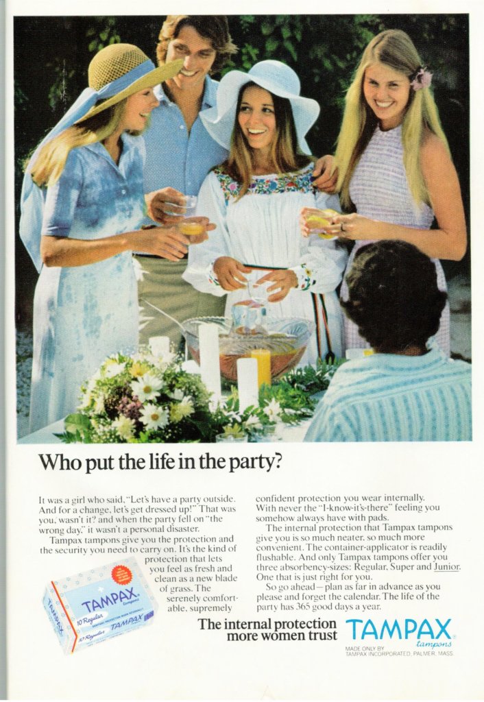
Tampax tampon ads have always had the potential personal disaster element to them. You never know what would happen if the event happened on the “wrong” day – horrors! The ads always showed women doing fun things – skiing, swimming, horseback riding – without a care in the world. I personally really like this ad because it shows off Boho 70s “party” wear. I wore this look back in 1973, and to a large extent still have the same style today. Old habits die hard!
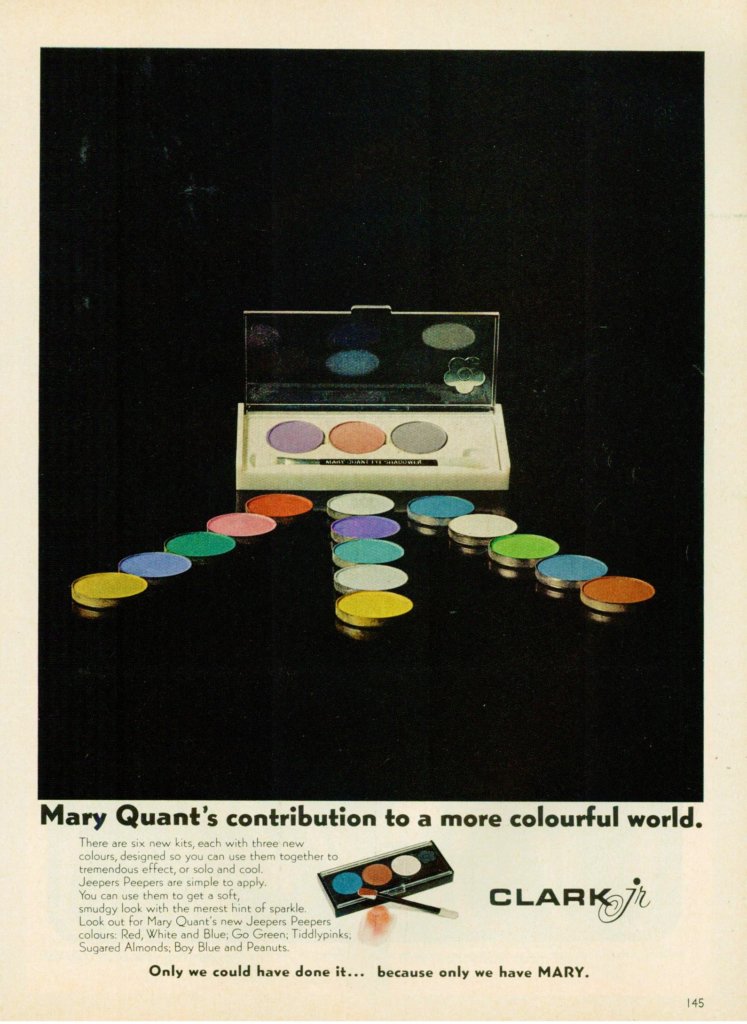
Mary Quant Jeepers Peepers – Glamour May 1973 ~ Finnfemme
This is a rather subdued ad for Mary Quant’s supposed “contribution to a more colourful world”. I almost overlooked it when doing a perusal of my vintage magazines. I am confused because the company is Clark Jr, which I could find no information on – possibly associated with designer Ossie Clark? It doesn’t show Mary Quant’s packaging very well either; perhaps because it is bland and unexciting. The layout of the ad is strange, but apparently there were six new kits with three new colours. The new Jeepers Peepers colours: Red, White and Blue, Go Green, Tiddlypinks, Sugared Almonds, Boy Blue and Peanuts. Designed so you can use them together to tremendous effect, or solo and cool.
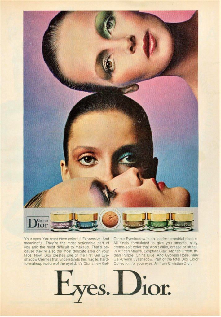
Christian Dior eye makeup was quite intense, colorful and vibrant in 1973. It is reminiscent of Biba’s English “Dolly” look that was popular in the UK at the time. These Gel Eyeshadow Cremes came in six tender terrestrial shades: African Mauve, Egyptian Clay, Afghan Green, Indian Purple, China Blue, and Cypress Rose. So lovely!
Farrah Fawcett for Wella Herbal Blossoms Shampoo ad – Mademoiselle April 1975 ~ Finnfemme
I think that model and actress Farrah Fawcett had the most magnificent hair EVER. So, of course, she scored many modeling contracts showcasing her mane in hair care advertisements of the 1970s.
Wella Herbal Blossoms shampoo seemed like a knockoff of the popular Clairol Herbal Essence shampoo. I really don’t remember it at all, but if it made my hair look like Farrah’s, I should have used it!
Dorothy Gray Fun Frosts – Mademoiselle April 1975 ~ Finnfemme
I love this great Art Deco-ish ad! The design and colors are just fabulous. I don’t remember Dorothy Gray so much, but these “Fun Frosts” lip and nail colors are wonderful. Inspired by the 1975 move Funny Lady, starring Barbra Streisand as Fanny Brice, the lip colors and nail gloss came in three dazzling shades of Porcelain Pink, Twinkling Rose and Shimmery Bronze. Shades of the glamorous thirties. When Broadway was spectacular. And Fanny Brice was the goddess of fun.
~Marilyn
I'm Marilyn, and I'm obsessed with vintage clothing, thrift stores, clotheslines, and Chanel. Welcome to my down-to-earth world!


 I'm Marilyn, and I'm obsessed with vintage clothing, thrift stores, clotheslines, and Chanel. Welcome to my down-to-earth world!